Back to Home
Airbnb & Isometric Icons
Where tiny 3D forms became symbols of a much bigger shift in product and purpose.
built using
built by
© Adith NareinTap Hover over
the Icons
My key takeaway
Design is most powerful when it aligns deeply with vision.
Hover over the Icons


The Geometry of Imagination: Isometric Icons in Design
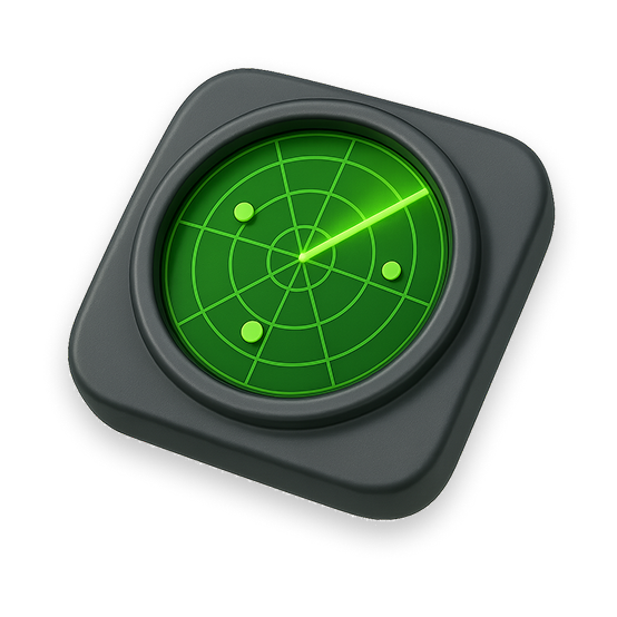
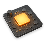
Airbnb's new isometric icon system is the result of a deeply considered design transformation, not just a visual upgrade. Working closely with Jony Ive's team, Airbnb reimagined how interface elements could feel soft, dimensional, almost handcrafted. These icons weren't simply drawn; they were modeled like objects, with lighting, shadows, and materials designed to evoke the warmth of physical space. The process involved creating hundreds of prototypes, exploring how form, color, and animation could bring emotional resonance to the smallest parts of the interface.
This wasn't about style it was about storytelling. As Airbnb shifted from a booking app to a broader lifestyle platform, the design needed to reflect that ambition. The isometric icons became tiny portals into that world: expressive, interactive, and unified. Backed by a custom rendering system called Lava, they animate gracefully, scale seamlessly, and help users intuitively navigate a richer, more layered experience. It's a rare case where UI detail becomes central to brand evolution.